Sample deliverable — integration, and proof it did not eat the biology
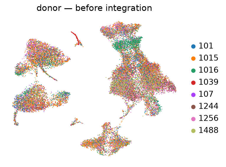
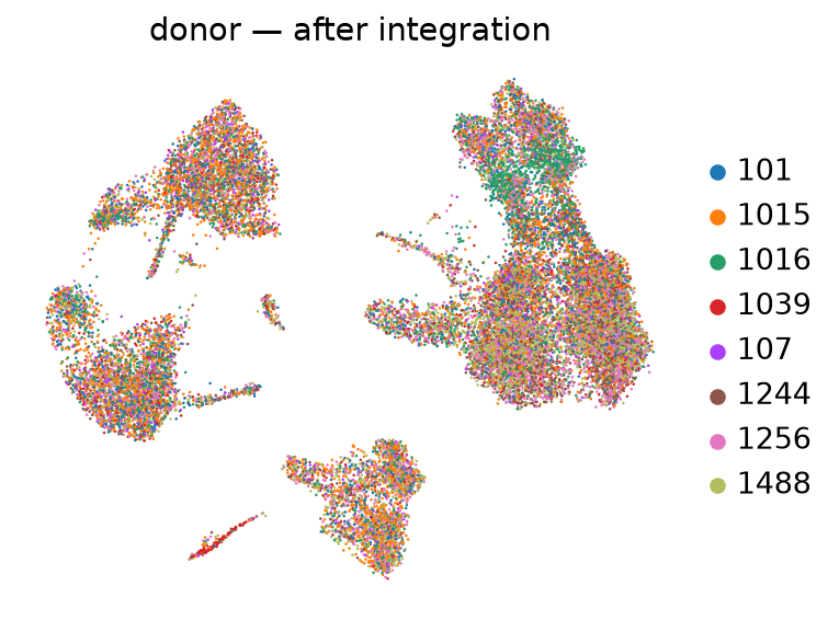
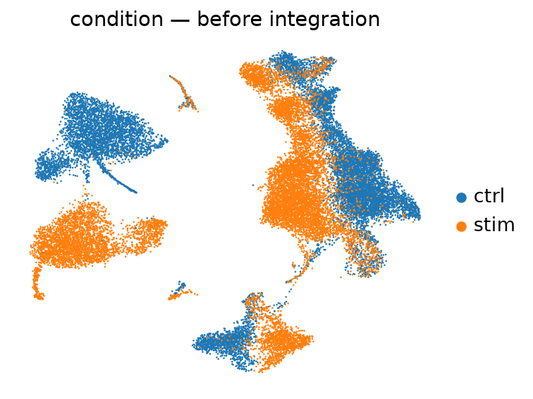
Integration reports are usually judged on one thing: do the batches mix? That is half a metric — perfect mixing is trivially achieved by destroying the signal, and the plots look better as that happens. Here is the other half, measured, on GEO GSE96583 — 8 donors, control vs IFN-β.
The measurement
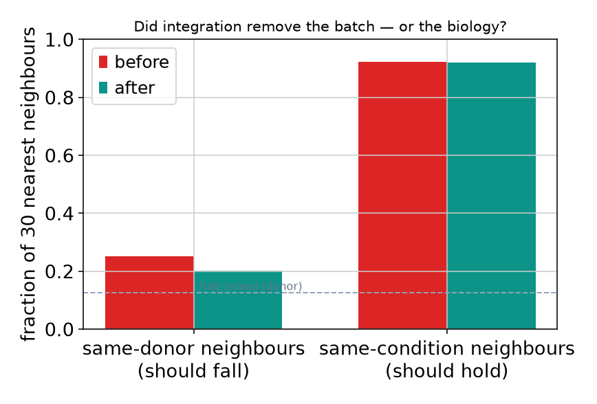
For every cell we take its 30 nearest neighbours and ask two questions: what fraction share its donor, and what fraction share its condition. Good integration pushes the first down towards chance (12.5% for 8 donors) and leaves the second alone.
| Same-donor neighbours should fall |
Same-condition neighbours should hold | |
|---|---|---|
| Before integration | 25.2% | 92.2% |
| After Harmony | 20.1% | 92.1% |
| Fully mixed baseline | 12.5% | — |
How to read this honestly
Two things are true here and both belong in a report. The donor effect was reduced by 20.2% but not eliminated — 20.1% of neighbours still share a donor against a 12.5% floor, which is what real biological variation between people looks like and is not something to force away. And the treatment signal moved by -0.1% — that is the number that matters: the correction did not dissolve the interferon response it was supposed to leave alone.
Had we tuned the integration harder until donors mixed perfectly, the second number would have fallen with it, and the paper would have reported a weakened treatment effect caused entirely by the analysis.
Before and after
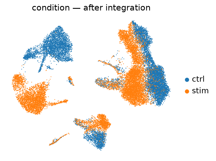
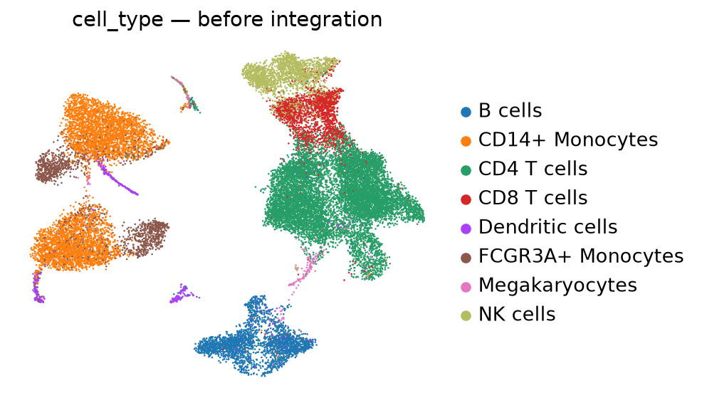
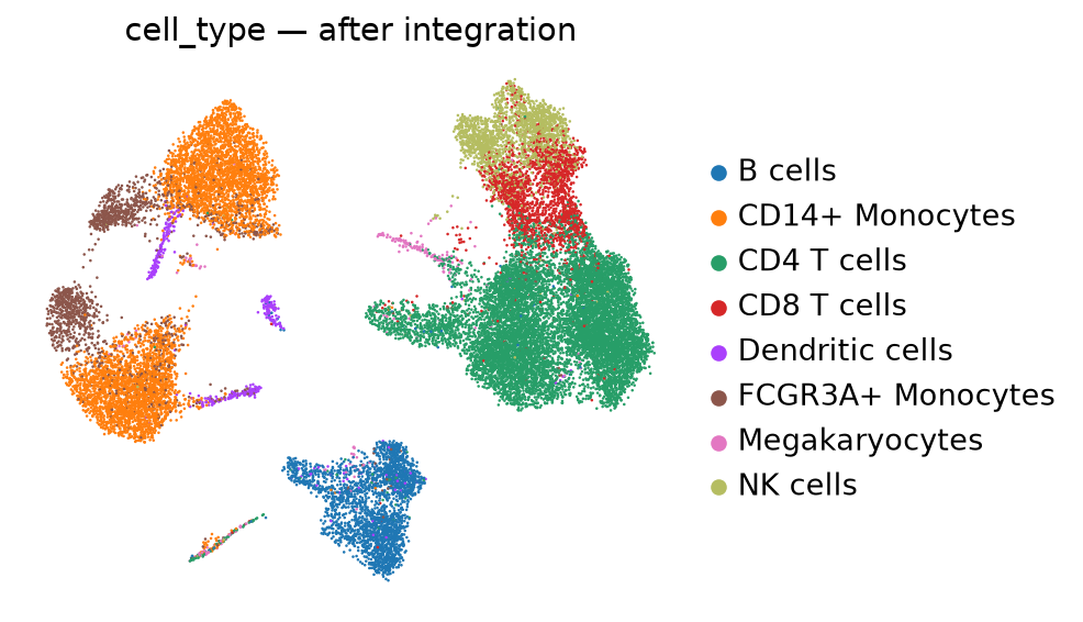
What we include in a paid integration
- The batch variable chosen deliberately — technical batch, not condition (why that distinction decides everything).
- This before/after measurement, reported whether it flatters the result or not.
- A known-difference test: a population expected to differ between conditions must still separate afterwards.
- Statistics run on uncorrected counts with batch as a covariate — integrated embeddings are for clustering and visualisation, not for p-values.
- The script, so you can re-run it: run_integration.py.